Article Overview
- Impressionist color theory fundamentals
- How Monet's techniques translate to digital media
- The French approach to color harmony
- Practical color palette creation tools
- Case studies in contemporary applications

When we examine the history of color theory and application, few national traditions have been as influential as those developed in France. From the revolutionary approaches of the Impressionists to the refined palettes of modern French design, there's a distinctive sensibility that continues to shape how we understand and use color in the digital age.
This article explores the evolution of French color theory and its practical applications for today's designers, photographers, and digital artists. By understanding these foundational principles, we can develop more sophisticated approaches to color that elevate our creative work.
The Impressionist Revolution: A New Way of Seeing Color
The story of modern color theory begins in late 19th century France with the Impressionist movement. Artists like Claude Monet, Pierre-Auguste Renoir, and Camille Pissarro challenged conventional approaches to color by focusing on how light affects our perception of hues in natural settings.
Several key principles emerged from their experiments that remain relevant today:
Optical Mixing and Divided Color
Rather than physically mixing pigments to create intermediate colors, the Impressionists placed pure colors side by side, allowing the viewer's eye to blend them optically. This technique, known as divisionism or chromatic division, created more vibrant, luminous effects than traditional blending methods.
In the digital realm, this principle finds expression in techniques like dithering, pixel manipulation, and textured overlays that create rich, vibrant colors through the juxtaposition of contrasting hues rather than flat application.
The Abolition of Black
Monet famously declared, "Black is not a color," and advocated for creating shadows and dark areas using complementary colors rather than black pigment. This approach resulted in more vibrant, atmospheric shadows that contained hints of color found in their surroundings.
For digital designers, this principle suggests using rich, deep colors instead of pure black for shadows and dark areas—creating more dimensional, immersive color experiences. Even in monochromatic designs, slight color tints in dark areas create more visual interest than absolute black.
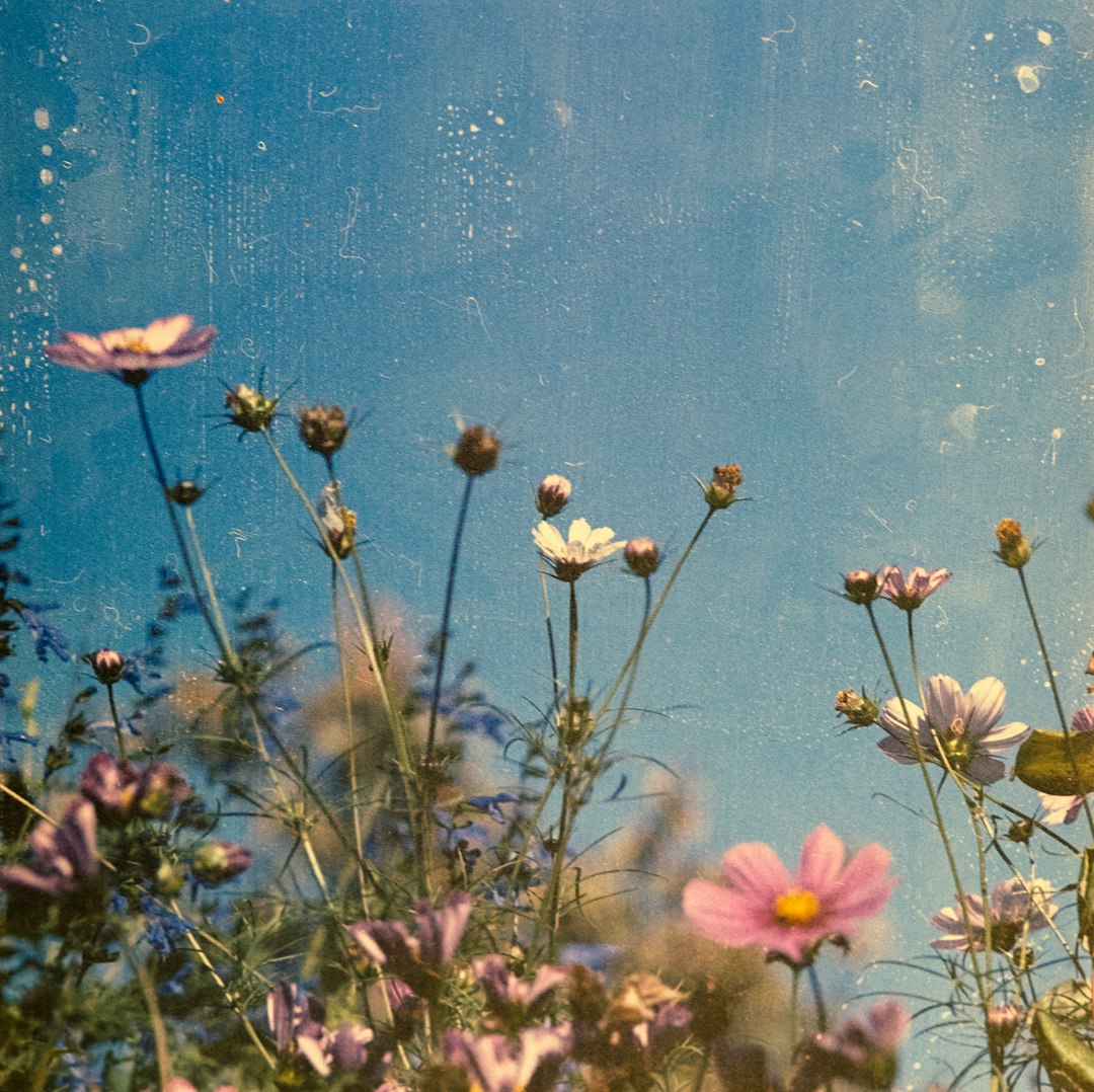
Analysis of Impressionist color techniques and their modern applications
Atmospheric Perspective Through Color
The Impressionists carefully observed how atmosphere affects color perception at different distances. Objects in the distance appear cooler (bluer) and less saturated due to atmospheric interference, while closer objects display warmer, more saturated colors.
This principle translates directly to contemporary design and digital illustration, where manipulating color temperature and saturation creates convincing depth and spatial relationships without relying on linear perspective alone.
The French Approach to Color Harmony
Beyond the specific techniques of the Impressionists, French color theory developed distinctive approaches to color harmony that continue to influence design aesthetics. These approaches are characterized by several key principles:
Sophisticated Neutrals
French color sensibility places great emphasis on complex neutrals—colors that are neither purely chromatic nor achromatic, but subtle mixtures that create sophisticated backgrounds for more vibrant accent colors. These might include warm grays with slight violet undertones, cool beiges with hints of green, or taupe colors that shift between warm and cool depending on adjacent hues.
In digital design, this translates to creating custom neutral backgrounds rather than using default whites or grays, developing signature neutral palettes that give projects distinctive atmosphere while maintaining versatility.
Controlled Contrast
Rather than maximizing contrast for impact, French color harmony often relies on carefully calibrated contrast relationships. This might involve using colors of similar value but different hues, or creating focal points through small areas of saturated color against more subdued backgrounds.
This approach creates more subtle, sophisticated visual hierarchies than the high-contrast techniques common in some contemporary design styles.
Contextual Color Relationships
French color theory emphasizes that colors should never be considered in isolation, but always in relationship to their surroundings. A particular shade of blue might appear perfect in one context but jarring in another, depending on adjacent colors, lighting conditions, and overall composition.
For digital designers, this principle encourages testing color combinations in their intended contexts rather than selecting them in isolation from swatches or color pickers.
Practical Tip
When developing color palettes, always test how colors interact in actual layouts rather than judging them as isolated swatches. A color that seems perfect in isolation may behave differently when placed alongside other elements in your design.
Translating Impressionist Techniques to Digital Media
How can we apply these historical approaches to contemporary digital design and photography? Several techniques allow us to capture the essence of French color theory in modern media:
Digital Optical Mixing
Rather than using flat color fields, experiment with textured overlays, grain effects, and semi-transparent layers to create more vibrant, dimensional color experiences. This digital equivalent of divisionism creates colors that feel more alive and responsive to their surroundings.
In photography, this might involve embracing certain types of noise or grain rather than eliminating them entirely, using their textural qualities to enhance color richness.
Atmospheric Gradients
Subtle gradients that shift in temperature (warm to cool) can create convincing atmospheric effects in digital illustrations and UI designs. Rather than using mechanical gradients that simply move from light to dark, consider how colors might shift in hue and saturation across a composition to create depth.
Digital design utilizing principles from French color theory
Complex Shadow Colors
Following Monet's rejection of black, create digital shadows using colors complementary to your light sources. In photography, this might mean careful white balance adjustments to preserve color in shadow areas; in digital illustration, it means selecting shadow colors that contain hints of complementary hues.
Practical Tools for Creating French-Inspired Color Palettes
For designers looking to incorporate French color sensibilities into their work, several approaches and tools can be particularly helpful:
Color Extraction from French Art
Tools like Adobe Color allow you to extract color palettes directly from Impressionist and Post-Impressionist paintings. This technique provides not just individual colors but their relationships and proportions, offering insight into how these masters constructed their harmonies.
Historical collections like the Musée d'Orsay provide high-resolution digital archives that are perfect for this type of color extraction.
Analogous Plus Complement Palettes
A particularly French approach to color harmony involves selecting several adjacent colors on the color wheel (analogous colors) plus a single complement as an accent. This creates harmonious backgrounds with strategic points of contrast—a signature of French design sensibility.
For example, you might combine various shades of blue-green with a carefully selected rusty orange accent, or warm neutrals with a strategic violet highlight.
Limited Palette Photography
In photography, experiment with processing techniques that limit and harmonize the color palette of an image. Rather than maximizing color variety, consider how a more controlled palette might create a more cohesive, sophisticated result—particularly for collections of images that will be viewed together.
Practical Tip
When creating a color palette inspired by French sensibilities, start with 2-3 closely related neutrals, add 2-3 related mid-tones in a similar temperature, and finish with a single accent color at a higher saturation. This structure creates sophisticated harmony with controlled points of interest.
Case Studies: Contemporary Applications
To understand how these historical principles manifest in contemporary work, let's examine several case studies of modern design and photography that successfully incorporate French color sensibilities:
Case Study 1: Le Bon Marché Brand Identity
The visual identity of this iconic Parisian department store demonstrates sophisticated use of neutrals punctuated by carefully selected accent colors. The primary palette consists of complex cream and taupe tones with subtle temperature variations, allowing merchandise to stand out while maintaining a distinctive brand atmosphere.
What makes this approach distinctively French is not just the selection of colors but their proportional use—large areas of sophisticated neutrals with precise, minimal application of more saturated hues.
Case Study 2: Jacquemus Fashion Photography
French fashion house Jacquemus has developed a signature photographic style that applies Impressionist color principles to contemporary fashion imagery. Their campaigns feature carefully controlled color palettes with subtle atmospheric gradients and strategic pops of saturated color.
Particularly notable is their approach to shadow areas, which contain rich color information rather than falling to black—a direct application of Monet's principles to digital photography.
Case Study 3: French Digital Product Design
Applications and websites from French digital studios often display distinctive color approaches that separate them from international counterparts. Firms like Locomotive and Immersive Garden create digital experiences with sophisticated color relationships that feel distinctly French in their restraint and harmony.
These interfaces typically feature subtle background colors rather than stark white, limited but purposeful color accents, and careful attention to how colors shift across different sections of the experience.
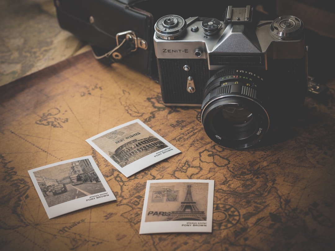
Example of contemporary French design utilizing traditional color principles
Conclusion: The Continuing Relevance of French Color Theory
As we've explored throughout this article, French approaches to color—from the revolutionary techniques of the Impressionists to the refined sensibilities of contemporary design—offer valuable principles for today's creative professionals. These approaches aren't simply historical artifacts but living traditions that continue to evolve in the digital age.
By understanding and applying these principles, designers and photographers can develop more sophisticated, nuanced approaches to color that elevate their work beyond current trends. The French color tradition reminds us that true innovation often comes not from rejecting history but from reinterpreting it for new contexts and technologies.
Whether you're designing user interfaces, creating photographic collections, or developing brand identities, the principles of French color theory offer pathways to more refined, distinctive work that stands apart from the ephemeral trends of digital design.
Share this article:


